Initial Query
Generate an HTML file that uses flexbox to create a webpage with a header 200px at the top (colored red), and the rest of the body split 100px for a left sidebar (in blue), 100px for a right sidebar (in green), and the rest of the page in the middle (in white).
LLM Generation
Query
Generate an HTML file that uses flexbox to create a webpage with a header 200px at the top (colored red), and the rest of the body split 100px for a left sidebar (in blue), 100px for a right sidebar (in green), and the rest of the page in the middle (in white).
Output
Okay, here is the HTML file (`layout.html`) that uses Flexbox to create the described layout.
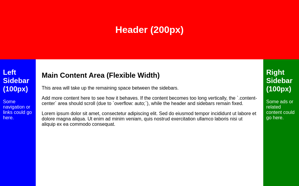
1 2 3 4 5 6 7 8 9 10 11 12 13 14 15 16 17 18 19 20 21 22 23 24 25 26 27 28 29 30 31 32 33 34 35 36 37 38 39 40 41 42 43 44 45 46 47 48 49 50 51 52 53 54 55 56 57 58 59 60 61 62 63 64 65 66 67 68 69 70 71 72 73 74 75 76 77 78 79 80 81 82 83 84 85 86 87 88 89 90 91 92 93 94 95 | <!DOCTYPE html> <html lang="en"> <head> <meta charset="UTF-8"> <meta name="viewport" content="width=device-width, initial-scale=1.0"> <title>Flexbox Layout Example</title> <style> /* Basic Reset */ html, body { margin: 0; padding: 0; height: 100%; /* Ensure body takes full height */ font-family: sans-serif; /* Optional: for better readability */ } /* Make body a flex container for header + main content area */ body { display: flex; flex-direction: column; /* Stack header and main area vertically */ min-height: 100vh; /* Ensure body takes at least full viewport height */ } /* Header Styling */ .header { height: 200px; background-color: red; color: white; /* For text visibility */ display: flex; /* Optional: To center content inside header */ justify-content: center; /* Optional: To center content inside header */ align-items: center; /* Optional: To center content inside header */ flex-shrink: 0; /* Prevent header from shrinking */ } /* Main Content Area Container (holds the three columns) */ .main-content-area { display: flex; /* Make this a flex container for the columns */ flex-grow: 1; /* Allow this area to grow and fill remaining vertical space */ /* No need for flex-direction: row; as it's the default */ } /* Left Sidebar Styling */ .sidebar-left { width: 100px; /* Fixed width */ flex-shrink: 0; /* Prevent sidebar from shrinking */ background-color: blue; color: white; /* For text visibility */ padding: 10px; /* Optional: Add some padding */ } /* Center Content Styling */ .content-center { flex-grow: 1; /* Allow this area to grow and fill remaining horizontal space */ background-color: white; padding: 20px; /* Optional: Add some padding */ overflow: auto; /* Add scrollbars if content overflows */ } /* Right Sidebar Styling */ .sidebar-right { width: 100px; /* Fixed width */ flex-shrink: 0; /* Prevent sidebar from shrinking */ background-color: green; color: white; /* For text visibility */ padding: 10px; /* Optional: Add some padding */ } </style> </head> <body> <header class="header"> <h1>Header (200px)</h1> </header> <div class="main-content-area"> <aside class="sidebar-left"> <h2>Left Sidebar (100px)</h2> <p>Some navigation or links could go here.</p> </aside> <main class="content-center"> <h2>Main Content Area (Flexible Width)</h2> <p>This area will take up the remaining space between the sidebars.</p> <p>Add more content here to see how it behaves. If the content becomes too long vertically, the `.content-center` area should scroll (due to `overflow: auto;`), while the header and sidebars remain fixed.</p> <p>Lorem ipsum dolor sit amet, consectetur adipiscing elit. Sed do eiusmod tempor incididunt ut labore et dolore magna aliqua. Ut enim ad minim veniam, quis nostrud exercitation ullamco laboris nisi ut aliquip ex ea commodo consequat.</p> <!-- Add more content here if needed to test scrolling --> </main> <aside class="sidebar-right"> <h2>Right Sidebar (100px)</h2> <p>Some ads or related content could go here.</p> </aside> </div> </body> </html> |
Extract Code
I extracted the following code from that output:
1 2 3 4 5 6 7 8 9 10 11 12 13 14 15 16 17 18 19 20 21 22 23 24 25 26 27 28 29 30 31 32 33 34 35 36 37 38 39 40 41 42 43 44 45 46 47 48 49 50 51 52 53 54 55 56 57 58 59 60 61 62 63 64 65 66 67 68 69 70 71 72 73 74 75 76 77 78 79 80 81 82 83 84 85 86 87 88 89 90 91 92 93 94 95 | <!DOCTYPE html> <html lang="en"> <head> <meta charset="UTF-8"> <meta name="viewport" content="width=device-width, initial-scale=1.0"> <title>Flexbox Layout Example</title> <style> /* Basic Reset */ html, body { margin: 0; padding: 0; height: 100%; /* Ensure body takes full height */ font-family: sans-serif; /* Optional: for better readability */ } /* Make body a flex container for header + main content area */ body { display: flex; flex-direction: column; /* Stack header and main area vertically */ min-height: 100vh; /* Ensure body takes at least full viewport height */ } /* Header Styling */ .header { height: 200px; background-color: red; color: white; /* For text visibility */ display: flex; /* Optional: To center content inside header */ justify-content: center; /* Optional: To center content inside header */ align-items: center; /* Optional: To center content inside header */ flex-shrink: 0; /* Prevent header from shrinking */ } /* Main Content Area Container (holds the three columns) */ .main-content-area { display: flex; /* Make this a flex container for the columns */ flex-grow: 1; /* Allow this area to grow and fill remaining vertical space */ /* No need for flex-direction: row; as it's the default */ } /* Left Sidebar Styling */ .sidebar-left { width: 100px; /* Fixed width */ flex-shrink: 0; /* Prevent sidebar from shrinking */ background-color: blue; color: white; /* For text visibility */ padding: 10px; /* Optional: Add some padding */ } /* Center Content Styling */ .content-center { flex-grow: 1; /* Allow this area to grow and fill remaining horizontal space */ background-color: white; padding: 20px; /* Optional: Add some padding */ overflow: auto; /* Add scrollbars if content overflows */ } /* Right Sidebar Styling */ .sidebar-right { width: 100px; /* Fixed width */ flex-shrink: 0; /* Prevent sidebar from shrinking */ background-color: green; color: white; /* For text visibility */ padding: 10px; /* Optional: Add some padding */ } </style> </head> <body> <header class="header"> <h1>Header (200px)</h1> </header> <div class="main-content-area"> <aside class="sidebar-left"> <h2>Left Sidebar (100px)</h2> <p>Some navigation or links could go here.</p> </aside> <main class="content-center"> <h2>Main Content Area (Flexible Width)</h2> <p>This area will take up the remaining space between the sidebars.</p> <p>Add more content here to see how it behaves. If the content becomes too long vertically, the `.content-center` area should scroll (due to `overflow: auto;`), while the header and sidebars remain fixed.</p> <p>Lorem ipsum dolor sit amet, consectetur adipiscing elit. Sed do eiusmod tempor incididunt ut labore et dolore magna aliqua. Ut enim ad minim veniam, quis nostrud exercitation ullamco laboris nisi ut aliquip ex ea commodo consequat.</p> <!-- Add more content here if needed to test scrolling --> </main> <aside class="sidebar-right"> <h2>Right Sidebar (100px)</h2> <p>Some ads or related content could go here.</p> </aside> </div> </body> </html> |
HTML Render
Rendering the webpage gives the following image:
PyFunc
Resulting in output: True