Initial Query
Generate an HTML file that uses flexbox to create a webpage with a header 200px at the top (colored red), and the rest of the body split 100px for a left sidebar (in blue), 100px for a right sidebar (in green), and the rest of the page in the middle (in white).
LLM Generation
Query
Generate an HTML file that uses flexbox to create a webpage with a header 200px at the top (colored red), and the rest of the body split 100px for a left sidebar (in blue), 100px for a right sidebar (in green), and the rest of the page in the middle (in white).
Output
 1
 2
 3
 4
 5
 6
 7
 8
 9
10
11
12
13
14
15
16
17
18
19
20
21
22
23
24
25
26
27
28
29
30
31
32
33
34
35
36
37
38
39
40
41
42
43
44
45
46
47
48
49 | <!DOCTYPE html>
<html lang="en">
<head>
<meta charset="UTF-8">
<meta name="viewport" content="width=device-width, initial-scale=1.0">
<title>Flexbox Layout</title>
<style>
body {
margin: 0;
height: 100vh;
display: flex;
flex-direction: column; /* Stack elements vertically */
}
header {
background-color: red;
height: 200px;
}
main {
display: flex;
flex: 1; /* Main content takes up remaining space */
}
nav {
background-color: blue;
width: 100px;
}
article {
background-color: white;
flex: 1; /* Article expands to fill available space */
}
aside {
background-color: green;
width: 100px;
}
</style>
</head>
<body>
<header>This is the header</header>
<main>
<nav>Left Sidebar</nav>
<article>Main Content Area</article>
<aside>Right Sidebar</aside>
</main>
</body>
</html>
|
**Explanation:**
1. **Basic Structure:**
- The HTML sets up a basic structure with a `header`, `main`, `nav` (left sidebar), `article` (main content), and `aside` (right sidebar).
2. **Flexbox Layout:**
- **`body`:**
- `display: flex;` enables flexbox for the body, making it a flex container.
- `flex-direction: column;` stacks the header and `main` elements vertically.
- **`header`:**
- Sets a fixed height of `200px` and a red background.
- **`main`:**
- `display: flex;` enables flexbox for the `main` element, allowing its children (`nav`, `article`, `aside`) to be arranged horizontally.
- `flex: 1;` makes the `main` element take up the remaining available space after the header.
- **`nav` (left sidebar):**
- Sets a fixed width of `100px` and a blue background.
- **`article` (main content):**
- `flex: 1;` makes the `article` expand to fill the remaining horizontal space after accounting for the left and right sidebars.
- Sets a white background.
- **`aside` (right sidebar):**
- Sets a fixed width of `100px` and a green background.
This code will create the desired layout with a fixed header, fixed-width sidebars, and a flexible main content area that adapts to the remaining space.
Extract Code
I extracted the following code from that output:
 1
 2
 3
 4
 5
 6
 7
 8
 9
10
11
12
13
14
15
16
17
18
19
20
21
22
23
24
25
26
27
28
29
30
31
32
33
34
35
36
37
38
39
40
41
42
43
44
45
46
47
48
49 | <!DOCTYPE html>
<html lang="en">
<head>
<meta charset="UTF-8">
<meta name="viewport" content="width=device-width, initial-scale=1.0">
<title>Flexbox Layout</title>
<style>
body {
margin: 0;
height: 100vh;
display: flex;
flex-direction: column; /* Stack elements vertically */
}
header {
background-color: red;
height: 200px;
}
main {
display: flex;
flex: 1; /* Main content takes up remaining space */
}
nav {
background-color: blue;
width: 100px;
}
article {
background-color: white;
flex: 1; /* Article expands to fill available space */
}
aside {
background-color: green;
width: 100px;
}
</style>
</head>
<body>
<header>This is the header</header>
<main>
<nav>Left Sidebar</nav>
<article>Main Content Area</article>
<aside>Right Sidebar</aside>
</main>
</body>
</html>
|
HTML Render
Rendering the webpage gives the following image:

PyFunc
Resulting in output:
True
Initial Query
Generate an HTML file that uses flexbox to create a webpage with a header 200px at the top (colored red), and the rest of the body split 100px for a left sidebar (in blue), 100px for a right sidebar (in green), and the rest of the page in the middle (in white).
LLM Generation
Query
Generate an HTML file that uses flexbox to create a webpage with a header 200px at the top (colored red), and the rest of the body split 100px for a left sidebar (in blue), 100px for a right sidebar (in green), and the rest of the page in the middle (in white).
Output
 1
 2
 3
 4
 5
 6
 7
 8
 9
10
11
12
13
14
15
16
17
18
19
20
21
22
23
24
25
26
27
28
29
30
31
32
33
34
35
36
37
38
39
40
41
42
43
44
45
46
47
48
49
50 | <!DOCTYPE html>
<html lang="en">
<head>
<meta charset="UTF-8">
<meta name="viewport" content="width=device-width, initial-scale=1.0">
<title>Flexbox Layout</title>
<style>
body {
display: flex;
flex-direction: column;
height: 100vh;
margin: 0;
}
header {
background-color: red;
height: 200px;
}
main {
display: flex;
flex: 1; /* Takes up remaining space */
}
aside.left {
background-color: blue;
width: 100px;
}
section {
background-color: white;
flex: 1; /* Takes up remaining space */
}
aside.right {
background-color: green;
width: 100px;
}
</style>
</head>
<body>
<header>
</header>
<main>
<aside class="left"></aside>
<section></section>
<aside class="right"></aside>
</main>
</body>
</html>
|
**Explanation:**
1. **Basic Setup:**
- The `html`, `head`, and `body` tags set up the basic HTML structure.
- The `style` tag is used to define the CSS rules for the layout.
2. **Flexbox Container (`body`):**
- `display: flex;`: Makes the `body` element a flex container.
- `flex-direction: column;`: Stacks the header and main content vertically.
- `height: 100vh;`: Makes the body take up the full viewport height.
- `margin: 0;`: Removes default browser margins.
3. **Header:**
- `background-color: red;`: Sets the header background to red.
- `height: 200px;`: Sets the header height.
4. **Main Content (`main`):**
- `display: flex;`: Makes `main` a flex container to arrange its children horizontally.
- `flex: 1;`: Allows `main` to take up the remaining space after the header.
5. **Sidebars and Content:**
- `aside.left`, `section`, `aside.right`: These elements represent the left sidebar, main content area, and right sidebar, respectively.
- `width: 100px;`: Sets the width for both sidebars.
- `flex: 1;` (for `section`): Makes the main content area flexible and occupy the remaining space between the sidebars.
6. **Background Colors:**
- `background-color` properties are used to set the colors for the header, sidebars, and main content area.
This code will create the layout you described, with the header, sidebars, and main content area correctly positioned and sized using flexbox.
Extract Code
I extracted the following code from that output:
 1
 2
 3
 4
 5
 6
 7
 8
 9
10
11
12
13
14
15
16
17
18
19
20
21
22
23
24
25
26
27
28
29
30
31
32
33
34
35
36
37
38
39
40
41
42
43
44
45
46
47
48
49
50 | <!DOCTYPE html>
<html lang="en">
<head>
<meta charset="UTF-8">
<meta name="viewport" content="width=device-width, initial-scale=1.0">
<title>Flexbox Layout</title>
<style>
body {
display: flex;
flex-direction: column;
height: 100vh;
margin: 0;
}
header {
background-color: red;
height: 200px;
}
main {
display: flex;
flex: 1; /* Takes up remaining space */
}
aside.left {
background-color: blue;
width: 100px;
}
section {
background-color: white;
flex: 1; /* Takes up remaining space */
}
aside.right {
background-color: green;
width: 100px;
}
</style>
</head>
<body>
<header>
</header>
<main>
<aside class="left"></aside>
<section></section>
<aside class="right"></aside>
</main>
</body>
</html>
|
HTML Render
Rendering the webpage gives the following image:

PyFunc
Resulting in output:
True
Initial Query
Generate an HTML file that uses flexbox to create a webpage with a header 200px at the top (colored red), and the rest of the body split 100px for a left sidebar (in blue), 100px for a right sidebar (in green), and the rest of the page in the middle (in white).
LLM Generation
Query
Generate an HTML file that uses flexbox to create a webpage with a header 200px at the top (colored red), and the rest of the body split 100px for a left sidebar (in blue), 100px for a right sidebar (in green), and the rest of the page in the middle (in white).
Output
 1
 2
 3
 4
 5
 6
 7
 8
 9
10
11
12
13
14
15
16
17
18
19
20
21
22
23
24
25
26
27
28
29
30
31
32
33
34
35
36
37
38
39
40
41
42
43
44
45
46
47
48
49
50
51
52
53
54
55
56
57
58 | <!DOCTYPE html>
<html lang="en">
<head>
<meta charset="UTF-8">
<meta name="viewport" content="width=device-width, initial-scale=1.0">
<title>Flexbox Layout</title>
<style>
body {
display: flex;
flex-direction: column; /* Stack elements vertically */
height: 100vh; /* Make body take full viewport height */
margin: 0; /* Remove default body margins */
}
header {
background-color: red;
height: 200px;
}
main {
display: flex;
flex: 1; /* Make main take remaining space */
}
nav {
background-color: blue;
width: 100px;
}
article {
background-color: white;
flex: 1; /* Make article take remaining space */
}
aside {
background-color: green;
width: 100px;
}
</style>
</head>
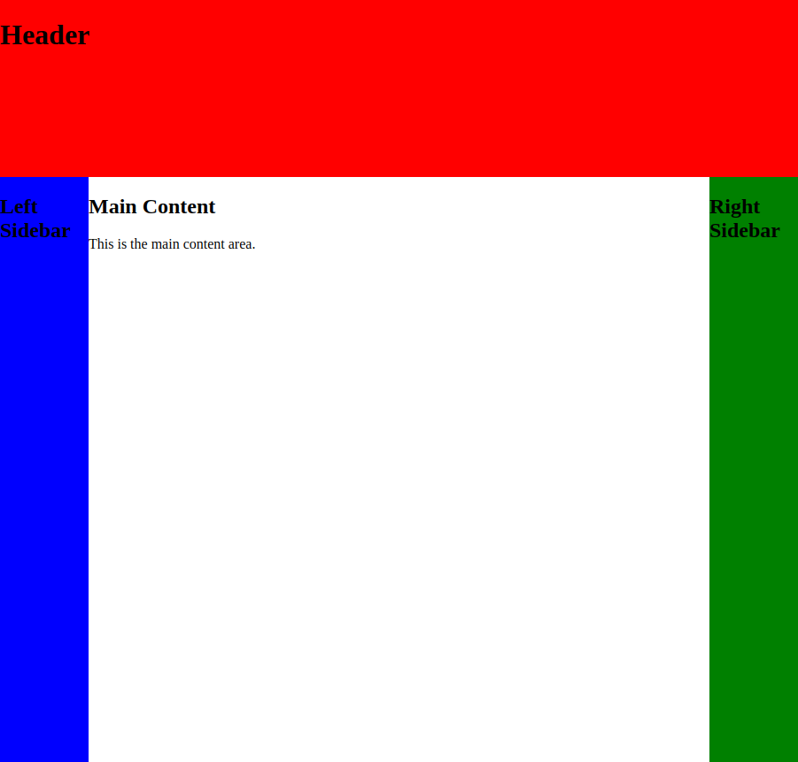
<body>
<header>
<h1>Header</h1>
</header>
<main>
<nav>
<h2>Left Sidebar</h2>
</nav>
<article>
<h2>Main Content</h2>
<p>This is the main content area.</p>
</article>
<aside>
<h2>Right Sidebar</h2>
</aside>
</main>
</body>
</html>
|
**Explanation:**
1. **Flexbox Setup:**
- `display: flex;` on the `body` and `main` elements enables flexbox layout.
- `flex-direction: column;` on the `body` stacks elements vertically.
- `height: 100vh;` on the `body` makes it take up the full viewport height.
2. **Header:**
- `height: 200px;` sets the header height.
- `background-color: red;` styles the background.
3. **Main Content Area:**
- `flex: 1;` on `main` makes it take up the remaining available space after the header.
4. **Sidebars and Content:**
- `width: 100px;` sets the width of the sidebars.
- `flex: 1;` on `article` makes it expand to fill the remaining space between the sidebars.
- Background colors are applied to distinguish the sections.
This code will create a webpage with the desired layout using flexbox.
Extract Code
I extracted the following code from that output:
 1
 2
 3
 4
 5
 6
 7
 8
 9
10
11
12
13
14
15
16
17
18
19
20
21
22
23
24
25
26
27
28
29
30
31
32
33
34
35
36
37
38
39
40
41
42
43
44
45
46
47
48
49
50
51
52
53
54
55
56
57
58 | <!DOCTYPE html>
<html lang="en">
<head>
<meta charset="UTF-8">
<meta name="viewport" content="width=device-width, initial-scale=1.0">
<title>Flexbox Layout</title>
<style>
body {
display: flex;
flex-direction: column; /* Stack elements vertically */
height: 100vh; /* Make body take full viewport height */
margin: 0; /* Remove default body margins */
}
header {
background-color: red;
height: 200px;
}
main {
display: flex;
flex: 1; /* Make main take remaining space */
}
nav {
background-color: blue;
width: 100px;
}
article {
background-color: white;
flex: 1; /* Make article take remaining space */
}
aside {
background-color: green;
width: 100px;
}
</style>
</head>
<body>
<header>
<h1>Header</h1>
</header>
<main>
<nav>
<h2>Left Sidebar</h2>
</nav>
<article>
<h2>Main Content</h2>
<p>This is the main content area.</p>
</article>
<aside>
<h2>Right Sidebar</h2>
</aside>
</main>
</body>
</html>
|
HTML Render
Rendering the webpage gives the following image:
PyFunc
Resulting in output:
True
Initial Query
Generate an HTML file that uses flexbox to create a webpage with a header 200px at the top (colored red), and the rest of the body split 100px for a left sidebar (in blue), 100px for a right sidebar (in green), and the rest of the page in the middle (in white).
LLM Generation
Query
Generate an HTML file that uses flexbox to create a webpage with a header 200px at the top (colored red), and the rest of the body split 100px for a left sidebar (in blue), 100px for a right sidebar (in green), and the rest of the page in the middle (in white).
Output
 1
 2
 3
 4
 5
 6
 7
 8
 9
10
11
12
13
14
15
16
17
18
19
20
21
22
23
24
25
26
27
28
29
30
31
32
33
34
35
36
37
38
39
40
41
42
43
44
45
46
47
48
49
50
51 | <!DOCTYPE html>
<html lang="en">
<head>
<meta charset="UTF-8">
<meta name="viewport" content="width=device-width, initial-scale=1.0">
<title>Flexbox Layout</title>
<style>
body {
margin: 0;
height: 100vh; /* Ensure body takes full viewport height */
display: flex;
flex-direction: column; /* Stack elements vertically */
}
header {
background-color: red;
height: 200px;
}
main {
display: flex;
flex: 1; /* Main content takes remaining space */
}
nav {
width: 100px;
}
#sidebar-left {
background-color: blue;
}
#sidebar-right {
background-color: green;
}
#content {
background-color: white;
flex: 1; /* Content area expands to fill remaining space */
}
</style>
</head>
<body>
<header>This is the header</header>
<main>
<nav id="sidebar-left">Left Sidebar</nav>
<section id="content">Main Content Area</section>
<nav id="sidebar-right">Right Sidebar</nav>
</main>
</body>
</html>
|
**Explanation:**
1. **Basic Setup:**
- The `<!DOCTYPE html>`, `<html>`, `<head>`, and `<body>` tags set up the basic HTML structure.
- The `<style>` tag contains the CSS rules for the layout.
2. **Flexbox Container (body):**
- `display: flex;` on the `body` element makes it a flex container.
- `flex-direction: column;` stacks the header and `main` sections vertically.
- `height: 100vh;` ensures the body takes up the full viewport height.
3. **Header:**
- `height: 200px;` sets the fixed height of the header.
- `background-color: red;` styles the header with a red background.
4. **Main Content Area (main):**
- `display: flex;` makes `main` a flex container to arrange its children horizontally.
- `flex: 1;` allows the `main` section to take up the remaining available space after the header.
5. **Sidebars (nav):**
- `width: 100px;` sets a fixed width for both sidebars.
- `background-color: blue;` and `background-color: green;` style the left and right sidebars respectively.
6. **Content Area (section):**
- `flex: 1;` allows the content area to expand and fill the remaining space between the sidebars.
- `background-color: white;` sets a white background for the content area.
This code will create a webpage with the layout you described, using flexbox for efficient and flexible arrangement of elements.
Extract Code
I extracted the following code from that output:
 1
 2
 3
 4
 5
 6
 7
 8
 9
10
11
12
13
14
15
16
17
18
19
20
21
22
23
24
25
26
27
28
29
30
31
32
33
34
35
36
37
38
39
40
41
42
43
44
45
46
47
48
49
50
51 | <!DOCTYPE html>
<html lang="en">
<head>
<meta charset="UTF-8">
<meta name="viewport" content="width=device-width, initial-scale=1.0">
<title>Flexbox Layout</title>
<style>
body {
margin: 0;
height: 100vh; /* Ensure body takes full viewport height */
display: flex;
flex-direction: column; /* Stack elements vertically */
}
header {
background-color: red;
height: 200px;
}
main {
display: flex;
flex: 1; /* Main content takes remaining space */
}
nav {
width: 100px;
}
#sidebar-left {
background-color: blue;
}
#sidebar-right {
background-color: green;
}
#content {
background-color: white;
flex: 1; /* Content area expands to fill remaining space */
}
</style>
</head>
<body>
<header>This is the header</header>
<main>
<nav id="sidebar-left">Left Sidebar</nav>
<section id="content">Main Content Area</section>
<nav id="sidebar-right">Right Sidebar</nav>
</main>
</body>
</html>
|
HTML Render
Rendering the webpage gives the following image:

PyFunc
Resulting in output:
True
Initial Query
Generate an HTML file that uses flexbox to create a webpage with a header 200px at the top (colored red), and the rest of the body split 100px for a left sidebar (in blue), 100px for a right sidebar (in green), and the rest of the page in the middle (in white).
LLM Generation
Query
Generate an HTML file that uses flexbox to create a webpage with a header 200px at the top (colored red), and the rest of the body split 100px for a left sidebar (in blue), 100px for a right sidebar (in green), and the rest of the page in the middle (in white).
Output
 1
 2
 3
 4
 5
 6
 7
 8
 9
10
11
12
13
14
15
16
17
18
19
20
21
22
23
24
25
26
27
28
29
30
31
32
33
34
35
36
37
38
39
40
41
42
43
44
45
46
47
48
49
50
51
52 | <!DOCTYPE html>
<html lang="en">
<head>
<meta charset="UTF-8">
<meta name="viewport" content="width=device-width, initial-scale=1.0">
<title>Flexbox Layout</title>
<style>
body {
display: flex;
flex-direction: column;
height: 100vh;
margin: 0;
}
header {
background-color: red;
height: 200px;
}
main {
display: flex;
flex-grow: 1; /* Allows main to take up remaining space */
}
nav {
background-color: blue;
width: 100px;
}
article {
background-color: white;
flex-grow: 1; /* Allows article to take up remaining space */
}
aside {
background-color: green;
width: 100px;
}
</style>
</head>
<body>
<header>This is the header</header>
<main>
<nav>Left Sidebar</nav>
<article>Main Content</article>
<aside>Right Sidebar</aside>
</main>
</body>
</html>
|
**Explanation:**
1. **Flexbox Setup:**
- `display: flex;` on the `body` and `main` elements enables flexbox layout for these containers.
- `flex-direction: column;` on the `body` arranges elements vertically (header, then main).
2. **Header:**
- `height: 200px;` sets a fixed height for the header.
- `background-color: red;` styles the header with a red background.
3. **Main Content Area:**
- `flex-grow: 1;` on the `main` element allows it to expand and fill the remaining height of the viewport.
4. **Sidebars and Content:**
- `width: 100px;` sets fixed widths for the left (`nav`) and right (`aside`) sidebars.
- `flex-grow: 1;` on the `article` element (main content) allows it to expand horizontally to fill the remaining space between the sidebars.
5. **Background Colors:**
- `background-color` styles are applied to visually distinguish the header, sidebars, and main content area.
This code will create a webpage layout where:
- The header occupies a fixed 200px at the top.
- The left and right sidebars are fixed at 100px wide.
- The main content area dynamically adjusts its width to fill the remaining space between the sidebars.
- The height of the entire layout adapts to the content within each section.
Extract Code
I extracted the following code from that output:
 1
 2
 3
 4
 5
 6
 7
 8
 9
10
11
12
13
14
15
16
17
18
19
20
21
22
23
24
25
26
27
28
29
30
31
32
33
34
35
36
37
38
39
40
41
42
43
44
45
46
47
48
49
50
51
52 | <!DOCTYPE html>
<html lang="en">
<head>
<meta charset="UTF-8">
<meta name="viewport" content="width=device-width, initial-scale=1.0">
<title>Flexbox Layout</title>
<style>
body {
display: flex;
flex-direction: column;
height: 100vh;
margin: 0;
}
header {
background-color: red;
height: 200px;
}
main {
display: flex;
flex-grow: 1; /* Allows main to take up remaining space */
}
nav {
background-color: blue;
width: 100px;
}
article {
background-color: white;
flex-grow: 1; /* Allows article to take up remaining space */
}
aside {
background-color: green;
width: 100px;
}
</style>
</head>
<body>
<header>This is the header</header>
<main>
<nav>Left Sidebar</nav>
<article>Main Content</article>
<aside>Right Sidebar</aside>
</main>
</body>
</html>
|
HTML Render
Rendering the webpage gives the following image:

PyFunc
Resulting in output:
True